

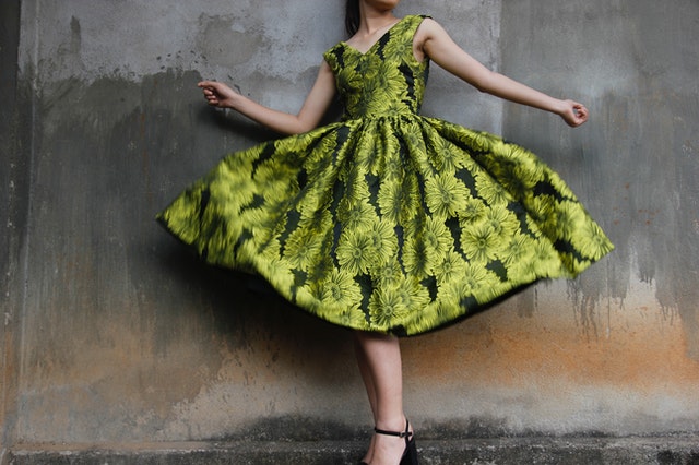
Why I consider it an art? Because it’s a thin line between looking fashionable and tacky when you play with prints, textures and fabrics. Personally, I’ve been always afraid of mixing prints,but now is inevitably with all this prints : floral, stripes, dots, spots, paisley&co. You need to face your fears, so these tips I read in The New York Times would be put into use.
1. Vary the scale. Mix a small neat print with a splashier one. Or an eye-popper with one that’s more neutral.
2. Stay within the same color family.
3. Mix up the fabrics, the weights — a rough-textured fabric with a more refined one. Somehow a nubby, slubby fabric pairs up more naturally with a flat weave than do two smooth-textured fabrics.
4. Toss in some polka dots, stripes or even leopard prints, which are easier to mix with other patterns because they’re simple and graphic. And they’re familiar to the eye.
5. Consider the accessories. Though it’s fun to tote a print bag with a print frock, you can tone down the brights with a great tan leather bag or pair of sandals. Straw works, too.


Thanks for the awesome tips… I'm a little scare when it comes to mixing prints myself. But thanks for these guidelines. xoxo
Yepp! Floral with the floral! 🙂
♥
Good tips. I print mix sometimes, but always more recognisable prints like stripes, animal print and plka dots. I don't own anything with a more "tribal" print, yet!
multumesc de sfaturi
imi vor fi de ajutor :*>:D<
Great tips, I'm scared of mixing patterns too but am willing to try these tips out. Hopefully I don't fall flat on my ass like a fool!
great post
Thanks for stopping by 🙂 The Edward picture is a card actually, it even plays a song when I open it 😀
I love mixing and matching prints! Fab advice and pic, darling!
xoxox,
CC
i think its art too! it always amazes me to see these mixed up together and looking great!
Hey 🙂
…and I agree, mixing prints and trying to remain fashionable without looking tacky can be a task. I'll mix and match colours, but as for prints, NO. Plaid would never blend perfectly or even oddly (in a good way) with strips (maybe stripes with polka dots on a good day ) ….just a small perspective, of how I feel with mixin'nmatchin'.
Have a fab day 🙂